728x90
반응형
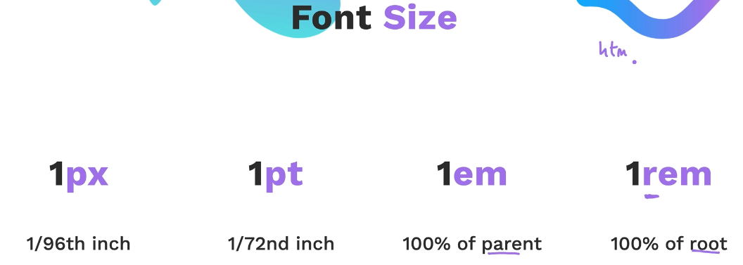
When specifying font sizes, various units can be used. Each unit has different characteristics and applications, making it important to choose the appropriate one based on the situation. Here's an explanation of the main units: 1px, 1pt, 1em, and 1rem, along with their significance.

1px (Pixel)
- Definition: The smallest unit on the screen, representing one pixel.
- Characteristics: An absolute unit with a fixed size.
- Use Case: Pixel units are useful when you need to specify an exact size. However, it can be challenging to adjust sizes relative to different screen resolutions and device sizes.
1pt (Point)
- Definition: A unit commonly used in print, where 1pt is 1/72 of an inch.
- Characteristics: Based on physical inches, mainly used in print design.
- Use Case: More suitable for print design than web design, where precise font sizes are needed.
1em
- Definition: A relative unit based on the font size of the current element.
- Characteristics: 1em equals the font size of the parent element. For example, if the parent element's font size is 16px, 1em equals 16px.
- Use Case: Useful in responsive web design. It allows you to adjust the size of elements relative to their parent, making font sizes flexible.
1rem
- Definition: A relative unit based on the font size of the root element (usually the html element).
- Characteristics: 1rem is based on the root font size of the HTML document. By default, browsers typically set the root font size to 16px.
- Use Case: Useful for maintaining consistent font sizes across the entire page while allowing for easy adjustments. You can set the font size once and have it apply consistently.
Importance
- Consistency: Using relative units is important for providing a consistent user experience across various devices and screen sizes. em and rem are particularly useful for maintaining this consistency.
- Accessibility: Relative units allow the font size to adjust automatically when users change the browser's font size, enhancing readability.
- Flexibility: Responsive web design often requires font sizes to adapt to different screen sizes. em and rem units provide this flexibility.
- Convenience: Pixel units are handy when you need to specify an exact size. However, for overall web design, em or rem units make maintenance easier.
In conclusion, the choice of font size units is crucial for the consistency, flexibility, and accessibility of a design. It's important to use the appropriate unit based on the specific requirements of the situation.
728x90
반응형